Colour isn’t just decoration; it’s strategy. In a commercial environment, the shades on your walls shape more than aesthetics. They affect employee performance, client confidence, and the way your brand is perceived before a single word is exchanged.
If you’re fitting out a new office or refreshing an existing workspace, choosing the right paint colours matters more than most realise. Here’s why.
Colour Psychology at Work
There’s real science behind colour and mood. Blue tones, for example, are known to reduce stress and improve focus, often used in corporate settings where clarity and concentration are key. Green encourages calmness and creativity, making it a strong choice for design studios or consulting rooms. Yellow and orange bring energy and warmth, ideal for brainstorming zones or client-facing areas where engagement matters.
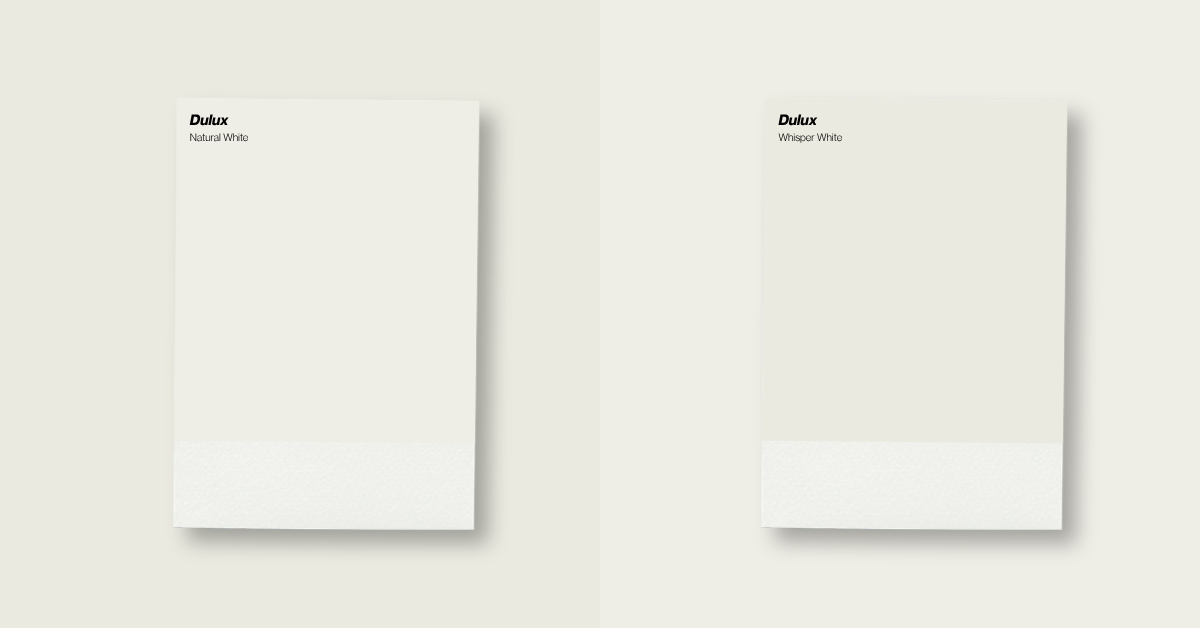
Even neutral shades like white, grey or beige have their place. These colours support focus, reduce visual clutter, and give flexibility in fast-changing environments.
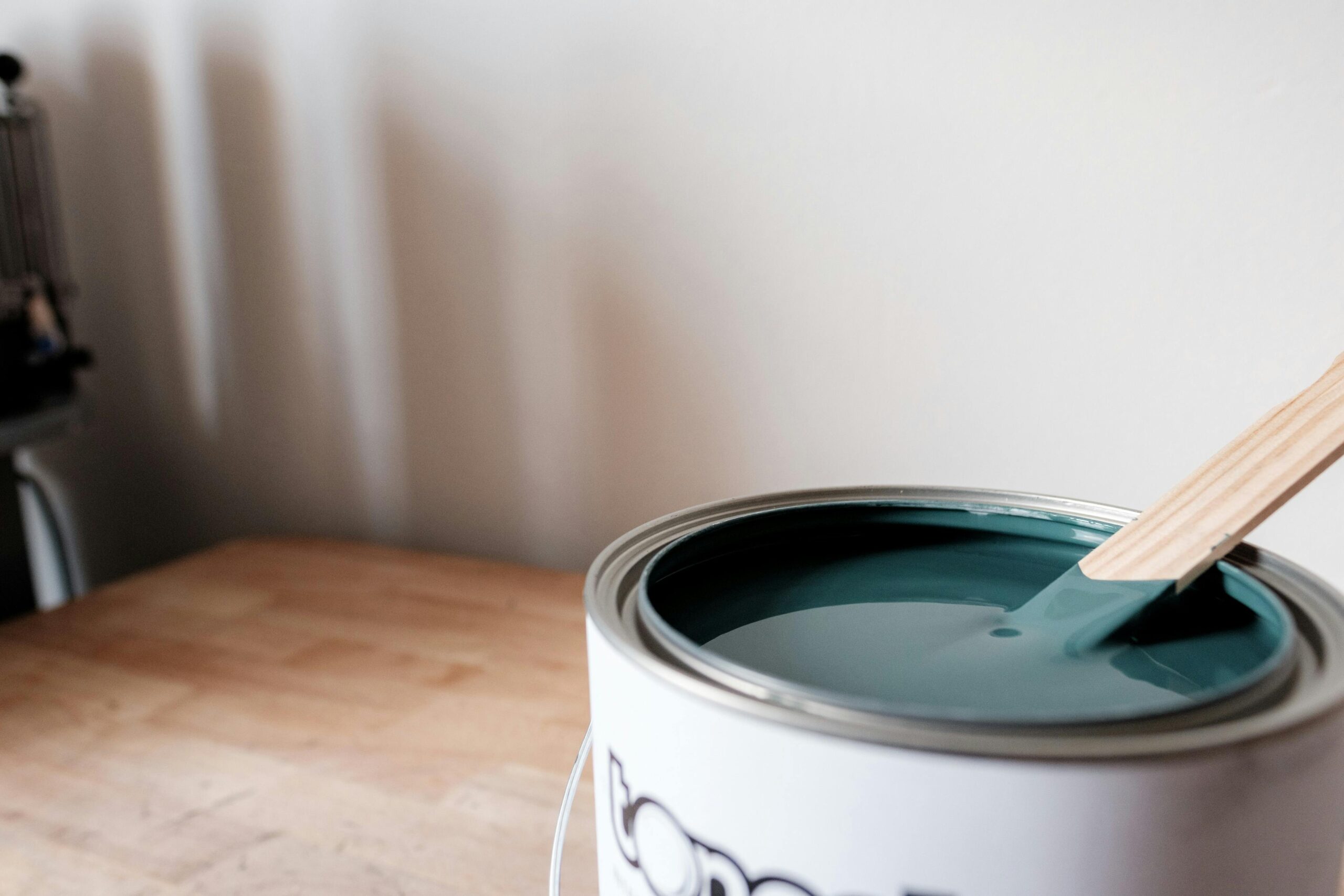
That balance between tone, function and branding is central to well-designed commercial interiors. Brisbane-based businesses, especially those in office tower environments, often use colour selection as part of broader fit-out strategies, where finishes and colours work hand in hand, just like in long-lasting interior repaints for high-use workplaces.
The Link Between Colour and Productivity
Research from institutions like the University of Texas has shown that thoughtfully chosen colours can improve motivation, focus and collaboration by up to 30%, depending on task and setting. At companies like Google and Adobe, colour psychology is built into workspace design: vibrant palettes in creative zones, calming tones in deep work areas.
It’s not about picking a favourite shade. It’s about understanding what the space needs to do. For collaborative environments, energising shades like orange or red can boost discussion and ideation. For solo-focused work, cooler tones like green or blue help keep minds clear and reduce fatigue.
This is also why workplaces often invest in the best paints suited to both purpose and climate.
Supporting Wellbeing and Focus
Beyond productivity, colour also influences how employees feel in a space. Greens and blues are linked to lower stress levels and improved mental clarity, which can support long-term wellbeing and reduce burnout in high-pressure roles.
Warmer tones like orange and yellow can lift mood and promote optimism, especially in collaborative areas where energy and communication matter. Even soft neutrals can contribute to a sense of order and calm, helping teams feel more grounded. For businesses prioritising mental health and retention, strategic colour choices become part of a broader approach to healthier, more supportive workplaces.
Client Perception Starts at the Door
The first thing clients notice isn’t a handshake or pitch; it’s the space they walk into. Colour has an immediate subconscious impact. Deep navy or charcoal grey suggests professionalism and trust. Bright white with natural timber suggests clarity, light, and calm. Bold accents in yellow or orange can communicate innovation and energy.
Small shifts in tone create big shifts in perception. For professional service spaces like financial firms, real estate offices, or clinics, soft greens and warm neutrals often convey calm and hygiene. Those looking to refresh or maintain this effect often turn to purpose-built medical clinic painting strategies across Queensland.
Choosing the Right Colours for Your Industry
There’s no one-size-fits-all solution, but there are smart starting points:
- Professional services (law, finance, consulting): Stick with timeless, calming neutrals. Add small accents in blues or deep greens to signal trust and composure.
- Creative industries (media, design, marketing): Use bold or energising colours to inspire fresh thinking. Yellows, oranges, and vibrant feature walls can make all the difference.
- Retail and hospitality: Align colours with target demographics. Think calming tones in wellness spaces, or rich, exciting hues in fashion or food outlets.
- Medical and clinics: Choose colours that ease anxiety and feel hygienic without being cold. Soft greens, whites, and light blues are consistent winners.
Businesses that routinely reassess colour choices tend to see stronger results in both presentation and staff engagement, especially when aligning selections with high-performance options like the best commercial paints for Brisbane’s climate.
Practical Tips to Implement Colour Strategically
- Use accent walls to introduce bold colours without overwhelming the space.
- Incorporate colour through furniture and textiles: cushions, chairs, rugs — for flexible seasonal updates.
- Pair neutral base tones with vibrant highlights to maintain visual clarity while supporting mood-setting.
- Plan colour use by area type: calming tones in waiting rooms, energising palettes in collaborative zones, and focus-friendly shades in individual workspaces.
Final Thoughts
Colour has power. It can quiet a distracted mind, energise a brainstorming session, or reassure a client they’re in the right place. And when done well, the right paintwork doesn’t just elevate a space, it supports business outcomes and enhances professional identity.
At Erseven Painting, over 8 years of commercial experience have shown that thoughtful colour strategy leads to better workplaces. Whether it’s a boardroom refresh, a brand-aligned fit-out, or a full repaint, every decision is made with long-term value in mind.
Book a free quote today to explore what colour can do for your team, your clients, and your workspace.