Ask any painter what the hardest colour decisions are and white will come up every time. Not because white is complicated in theory, but because it behaves differently on every wall, in every room, at every hour of the day. Two whites that look nearly identical on a colour card can read completely differently once they’re on four walls. Nowhere is this truer than with Dulux Natural White vs Dulux Whisper White, two of the most specified interior whites in Australia.
Both are warm-leaning, both appear on virtually every shortlist for residential interiors, and both get chosen for very different reasons. At ER7 Painting, we specify one or the other on the majority of our residential interior jobs across Brisbane, and we see the results every time we return to a finished space.
This guide breaks down the real difference between these two whites, how Brisbane’s light quality affects each of them, and which situations call for which colour, whether you’re painting a single bedroom or an entire commercial building.
Not sure which white suits your space? Book a colour consultation with ER7 Painting →
What Each Letter in DRSABCD Stands For
The key to choosing between these two whites is understanding their undertones and how Dulux officially classifies them.
In the 2024 Dulux Whites brochure, Natural White is classified as a neutral white, a shift from its earlier warm white classification. Whisper White remains a warm white. That distinction matters more than it sounds.
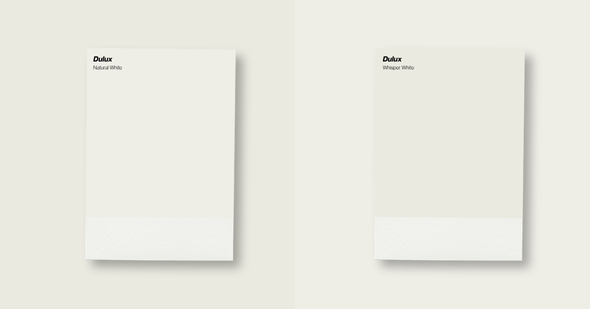
Dulux Natural White
Dulux Natural White has subtle creamy undertones but reads closer to a true neutral than most people expect. It sits in a middle ground: warmer than Dulux Lexicon or Vivid White, but noticeably more restrained than Whisper White or Antique White USA.
In well-lit rooms it reads as a clean, fresh white with just enough warmth to avoid feeling clinical. In lower-light conditions it can occasionally pull slightly green or grey depending on surrounding surfaces, something that catches some homeowners off guard.
- Classified as a neutral white in the current Dulux range
- Subtle creamy undertones that read as almost neutral in strong natural light
- Consistent throughout the day in most orientations
- Versatile across modern, coastal and transitional interiors
- Pairs well with cool greys, white cabinetry, stone benchtops and most flooring tones
Dulux Whisper White
Whisper White is warmer and more distinctive. Dulux describes it as a lush, warm white, and that holds up on the wall. It has a soft ivory quality with yellow undertones that give spaces a settled, inviting feel. The Light Reflectance Value sits at around 83, meaning it reflects a significant amount of light while still reading as a characterful off-white rather than a flat neutral.
- Classified as a warm white with more noticeable yellow-ivory undertones
- Adds warmth and depth without going as rich as Antique White USA
- Performs beautifully in rooms with period features, timber floors and natural materials
- In very bright north-facing rooms, the yellow undertone can become more prominent
- Works well on ceilings and trims as well as walls for a seamless tone-on-tone look
How Brisbane’s Subtropical Light Affects Interior White Selection
Brisbane’s light is intense and directional. The UV index exceeds 3 for most of the year, the sun sits high in the sky and the quality of natural light shifts dramatically between seasons and throughout the day. This matters for white selection in a way that Sydney or Melbourne-based colour guides don’t always account for.
North-Facing Rooms
North-facing rooms receive strong, direct sunlight for most of the day. In these spaces, Dulux Whisper White’s yellow undertone is amplified. What reads as a soft warm white on a test pot can read noticeably golden once the whole room is painted and the sun pours in. This isn’t a flaw, but it is something to anticipate. Clients who love warm tones will be happy. Those expecting a neutral white will be surprised.
Dulux Natural White handles north-facing rooms more predictably. Its neutral base holds steady across different light angles, making it the safer specification for high sun-exposure spaces.
South and East-Facing Rooms
South and east-facing rooms receive cooler, more diffused light. In these conditions, Natural White can occasionally pull slightly grey-green depending on surrounding tones, timber species, tiles or joinery. Dulux Whisper White’s warmth becomes an asset here, lifting the room and preventing it from reading cold or flat.
East-facing rooms that catch warm morning light suit either white. The key variable is how the room looks in the afternoon once that light has shifted.
The 7am to 4pm Problem: Why Brisbane Sunlight Changes Your Wall Colour
The same white can read completely differently at different times of day. In Brisbane this is particularly pronounced because the sun moves through a wide arc and light temperature changes substantially from morning to afternoon. This is why painting a test patch and observing it across a full day (rather than choosing from a colour card) is non-negotiable before committing to either white across an entire home or commercial space.
Timing your painting project correctly also affects results on the day. See our article on the best time to paint your Brisbane home for a long-lasting finish for more on this.
The Impact of Artificial Lighting on Warm vs. Neutral Whites
Natural light tells you half the story. The other half is your artificial lighting, because that’s what most rooms look like for a significant portion of the day.
Warm globes (2700K–3000K), common in residential downlights and lamps, push Dulux Whisper White further into its creamy, yellow register. In some spaces this creates a beautiful, intimate evening atmosphere. In others it tips into feeling too yellow or dated.
Cool globes (4000K–5000K), common in offices, schools, kitchens and bathrooms, can push Dulux Natural White into a greyer, cooler register. This occasionally surprises clients who expected consistent warmth.
The takeaway: if your space uses cool-white lighting, Natural White is the more predictable choice. If your space uses warm lighting, Whisper White will glow the way you intend it to.
Choosing Between Dulux Natural White and Whisper White for Commercial Projects
White selection for commercial interiors, including schools, offices and medical or allied health clinics, involves an additional layer of consideration that residential colour guides rarely address.
Schools and Educational Facilities
Classrooms and corridors in Queensland schools are typically fitted with cool-white fluorescent or LED lighting at around 4000K–5000K. Under these conditions, Whisper White’s warmth can become inconsistent and difficult to read as a neutral backdrop. Natural White performs more reliably, reading as clean and inviting while holding steady as natural light shifts throughout the school day.
For corridors, shared spaces and administration areas with mixed light sources, Natural White’s neutral classification gives it a clear advantage. It doesn’t compete with either light source.
For a full breakdown of paint selection for commercial buildings including schools and offices, see our guide to the best paint for commercial properties in Brisbane.
Offices and Commercial Spaces
Open-plan offices, meeting rooms and reception areas increasingly specify warm whites to avoid the institutional feel of stark cool neutrals. Both whites work in office environments, but the choice depends on the brief.
A contemporary, minimal office with lots of glazing and white joinery suits Natural White. It reads cleaner and more intentional. Where the brief calls for warmth and approachability, Whisper White delivers. Hospitality businesses, boutique retailers, clinics and wellness studios often find it better aligned with the atmosphere they’re creating.
For commercial clients, one practical note: both whites are widely available across Dulux’s commercial product ranges and can be specified in the appropriate sheen level for each surface.
Regular interior repaints reduce long-term costs in commercial buildings. See our article on why regular commercial painting saves money in Brisbane.
Managing a school, office or commercial building? Get a professional colour recommendation alongside your quote. Contact ER7 Painting for a commercial consultation →
Room-by-Room Guide: Where to Use Dulux Natural White vs. Whisper White
Best Applications for Dulux Natural White
- Open-plan living and dining areas with mixed orientations, where a consistent neutral carries across changing light
- Kitchens with white or stone benchtops, where a cleaner base prevents the room from reading too warm or yellowed
- Bathrooms and laundries with cool-toned tiles, chrome or white fixtures
- Commercial and office environments with cool-white artificial lighting
- Modern or coastal-influenced homes where the intent is a fresh, restrained palette
Best Applications for Dulux Whisper White
- Bedrooms and living rooms where warmth and comfort are the priority
- Period homes and character Queenslanders, where the ivory quality complements original timber and plasterwork details
- South-facing rooms that could benefit from additional visual warmth
- Rooms with warm-toned artificial lighting at 2700K-3000K
- Spaces with natural timber floors, rattan furniture or warm-toned stone, where the colour works with the material palette rather than against it
Can You Use Both Natural White and Whisper White in One Home?
Some homes suit both whites in different zones. A common approach is using Natural White through the main living, kitchen and bathroom areas, then switching to Whisper White in bedrooms and more intimate spaces. The transition reads naturally because both colours share warm undertones, but the contrast is subtle enough that the home doesn’t feel disjointed.
Where this requires care is in open-plan spaces where both zones are visible simultaneously. In those situations, the tonal difference can become more obvious than expected. A professional eye before committing to this approach is worth it.
How Paint Sheen and Finish Alter the Appearance of White Paint
Sheen level affects how either white reads on the wall, sometimes more than the colour itself.
- Flat or matt: absorbs light and makes whites read softer and more muted; less washable, so less practical in high-traffic commercial environments
- Low sheen: is the most commonly specified finish for residential walls and a reliable choice for both whites across most room types
- Satin: brings out the warmth in Whisper White more than Natural White; a good choice for feature walls or joinery where depth matters
- Semi-gloss and gloss: on trims and doors creates clean contrast against either white on the walls, and is standard for commercial interiors
Getting the surface right before any coat goes on is as important as the colour decision. Read our guide on how to prep a wall for painting.
Professional Recommendation: Which White is Best for a Brisbane Repaint?
If we had to specify one of these whites across the majority of jobs without seeing the site first, Natural White would be the default. It is more predictable, more versatile across Brisbane’s range of orientations and light conditions and holds up better under commercial lighting. On residential jobs with modern interiors, open-plan layouts, white joinery and stone finishes, Natural White is almost always the right call.
Whisper White earns its place when warmth is the brief. Period homes, south-facing bedrooms, rooms with heavy timber floors and clients who explicitly want an off-white with character. In those situations it performs beautifully in a way Natural White simply doesn’t.
The honest answer is that 15 minutes with a sample board in the actual light conditions of the actual room is worth more than any colour guide. These whites are close enough in the tin that the difference only reveals itself on the wall.
Unsure about the overall cost of an interior repaint before you decide? Our guide to the cost to paint a 4-bedroom house in Brisbane breaks down what to expect in 2026.
Weighing up DIY versus professional painting? See our comparison of DIY vs professional painting costs in Brisbane 2026.
Before booking any painter, read our article on the 7 warning signs you’re about to hire the wrong painter.
FAQs: Common Questions on Dulux Natural White and Whisper White
What is the main difference between Natural White and Whisper White?
Natural White is classified as a neutral white in the current Dulux range, with subtle creamy undertones that read as close to neutral in most light conditions. Whisper White is a warm white with more noticeable yellow-ivory undertones that give spaces a warmer, creamier feel.
Which is better for a north-facing room in Brisbane?
Natural White. In north-facing rooms that receive strong direct sunlight, Whisper White’s yellow undertone is amplified and can read more golden or creamy than expected. Natural White holds more consistently across high-UV light conditions.
Can I use Whisper White in an office or school?
Yes, but with consideration. Whisper White can appear inconsistent under cool-white fluorescent or LED lighting common in commercial spaces. Natural White typically performs better in offices and schools with 4000K-5000K lighting.
Which white is more popular with Brisbane painters?
Natural White is specified more often because of its versatility across orientations and room types. Whisper White is the preferred choice for character homes, bedrooms and spaces where warmth is a priority.
Should I test both whites before committing?
Yes. Paint a sample of each in the actual room and observe them at different times of day, including under artificial lighting in the evening. Colour cards and brochures do not replicate on-wall behaviour in real light conditions.
Do paint warranties differ between Natural White and Whisper White?
Both Natural White and Whisper White are available across the Dulux Interior range and carry the same product guarantees depending on the product line chosen. For more on what paint warranties actually cover, read our guide to paint warranties and guarantees.
Ready to get the right white on your walls? Our team can advise on colour, finish and product before a single brush stroke goes on. Book your interior painting quote with ER7 Painting →